Leon Schmitz · 11 September 2026
Examining the Interplay Between Mobile-First Indexing and Content Hierarchy in Retail Websites
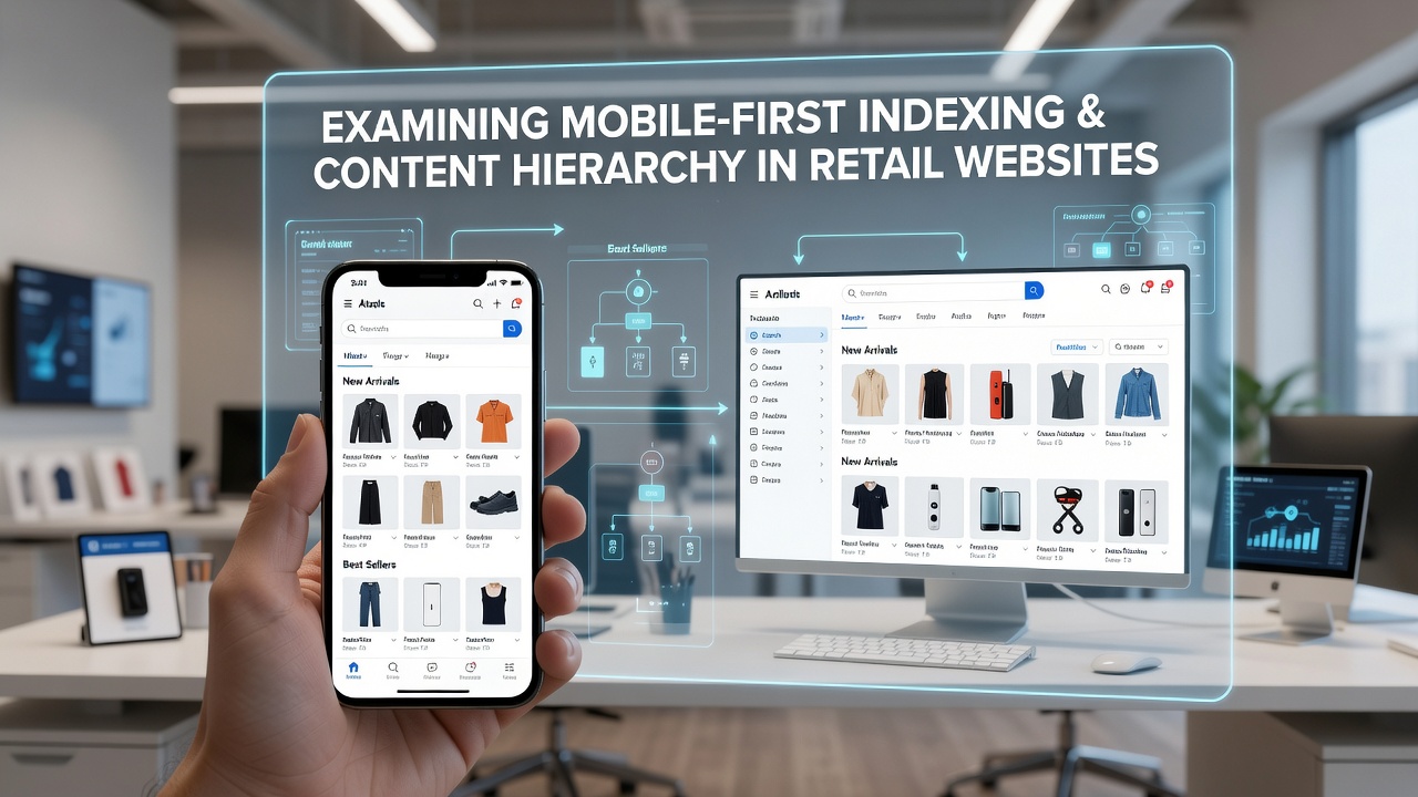
Mobile-first indexing has reshaped how search engines process retail websites, and this change directly influences the way content hierarchy gets constructed across product pages, category listings, and checkout flows. Search engines crawl and evaluate the mobile version of a site as the primary source for ranking signals, which means the order of headings, the prominence of navigation elements, and the placement of key retail information must function effectively on smaller viewports before any desktop considerations apply.
How Mobile-First Indexing Shapes Retail Site Evaluation
Retailers have adjusted their development practices since the complete transition to mobile-first indexing, and this adjustment requires that every structural decision account for limited screen space and touch-based interaction. Product descriptions, price displays, and add-to-cart buttons occupy critical positions in the visual hierarchy, while supporting elements such as related-item carousels receive secondary placement so they do not overwhelm core conversion paths. Observers note that sites maintaining clear heading levels from H1 through H3 allow crawlers to map topical importance accurately, even when those same headings collapse or reorder on mobile layouts.
Content Hierarchy Principles Applied to Retail Contexts
Content hierarchy refers to the deliberate organization of information through headings, lists, and visual weight, and retail websites rely on this structure to guide both users and search engines through extensive inventories. Main category pages typically open with broad H1 tags that name the product vertical, followed by H2 tags that break down subcategories or filter options, while individual product pages use H1 for the item name and H2 for specifications or customer reviews. Researchers have documented that consistent application of these levels improves crawl efficiency because search algorithms can parse semantic relationships without relying on desktop-only scripts or hidden elements.

Yet the same hierarchy must remain intact when the mobile stylesheet removes or condenses certain desktop components. Retail teams therefore test whether important subheadings stay visible above the fold on phones, and whether schema markup attached to those headings continues to communicate product availability and pricing data correctly.
Practical Adjustments Retail Sites Make Under Mobile-First Rules
Many retail platforms have reorganized navigation menus into hamburger icons or bottom bars that still preserve the logical order of categories, and this reorganization prevents the loss of hierarchical signals that once existed only in desktop mega-menus. Data from Google Search Central documentation shows that pages passing the mobile usability test maintain higher indexing coverage rates, particularly when heading structures align with the visible content order. In September 2026, additional reporting indicated that retail domains with mismatched mobile and desktop heading sequences experienced temporary drops in product-page impressions until hierarchy was synchronized.
Take one mid-sized apparel retailer that restructured its mobile templates to place size and color selectors directly beneath the H1 product title, and the change resulted in improved dwell-time metrics because users encountered decision points sooner. Another example involves grocery sites that moved nutritional information into expandable H3 sections, keeping the primary H2 for ingredients and allergens so that mobile users could scan essentials without scrolling past core hierarchy markers.
Technical Considerations for Hierarchy and Indexing Alignment
Developers employ responsive design frameworks that preserve heading order even when column counts change, and they verify that lazy-loaded content sections do not disrupt the sequential reading of H-tags by crawlers. Structured data placed on product pages further reinforces hierarchy by associating specific attributes with the correct heading levels, which helps retail sites appear in rich results that highlight price and availability. Studies from the European Commission digital policy reports indicate that e-commerce domains maintaining synchronized mobile-desktop hierarchies see steadier traffic patterns across seasonal peaks.
Retail analytics platforms now include mobile-specific audits that flag when important category filters appear only after users scroll past multiple promotional banners, and teams address these issues by elevating filter headings within the initial viewport. Such adjustments ensure that search engines continue to recognize the intended content priority regardless of device.
Conclusion
The relationship between mobile-first indexing and content hierarchy in retail websites centers on consistent structural signals that function across device types. Retailers who align heading sequences, navigation order, and schema placement with mobile rendering requirements maintain clearer pathways for both search crawlers and shoppers, and ongoing monitoring of indexing reports reveals whether those alignments continue to support visibility goals as site inventories expand.